How Do You Make a Histogram?
Note:
If you want to see data from a frequency table in a more visual way, try creating a histogram to show off that data! This tutorial shows you what to do!
Background Tutorials
-
Use a pair of perpendicular number lines, called axes, to define a coordinate system, with the intersection of the lines (the origin) arranged to coincide with the 0 on each line and a given point in the plane located by using an ordered pair of numbers, called its coordinates. Understand that the first number indicates how far to travel from the origin in the direction of one axis, and the second number indicates how far to travel in the direction of the second axis, with the convention that the names of the two axes and the coordinates correspond (e.g., x-axis and x-coordinate, y-axis and y-coordinate).
-
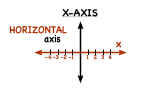
What is the X-Axis?
To graph a function or plot an ordered pair, you need to use a coordinate plane, so you should learn all about it! In this tutorial, you'll learn about the x-axis and see where it's located in the coordinate plane.
-
-
Display numerical data in plots on a number line, including dot plots, histograms, and box plots.
-
What is a Histogram?
Looking for info on histograms? Check this out:
-


Further Exploration
-
Display numerical data in plots on a number line, including dot plots, histograms, and box plots.

